Three Uncles
Three Uncles is a traditional Cantonese roast meat specialist in London founded by three experienced restauranteurs. With strong ties to childhoods in Hong Kong and an urge to showcase the best quality, authentic, affordable Sui Mei style street food in London the brand was born.
Our approach was to create visual nostalgia to complement the memories eating the food would evoke. The brand aesthetic plays with the balance between eastern traditionalism and western modernism, creating an authentic Hong Kong experience with a contemporary London twist. We created an identity that speaks as much of the food as it does of the founders and their Hong Kong origins without being cliche or predictable.
The branding, full of energy, emotion and nostalgia has helped the client reach a wide audience. The Chinese community relates to it, but it also appeals to local Londoners thanks to its paired back and confident style. Three Uncles has grown a huge following in a very short period of time, with a second restaurant now open in Camden Town.
Services:
Branding
Packaging
Art Direction
Website
Interior design consultancy
Links:
Features:
Eat & Go 2, Sandu Publishing
Choose Fonts, Hightone Publishing
Inspofinds Volume 2
Collaborators:
Photography by Salt Productions

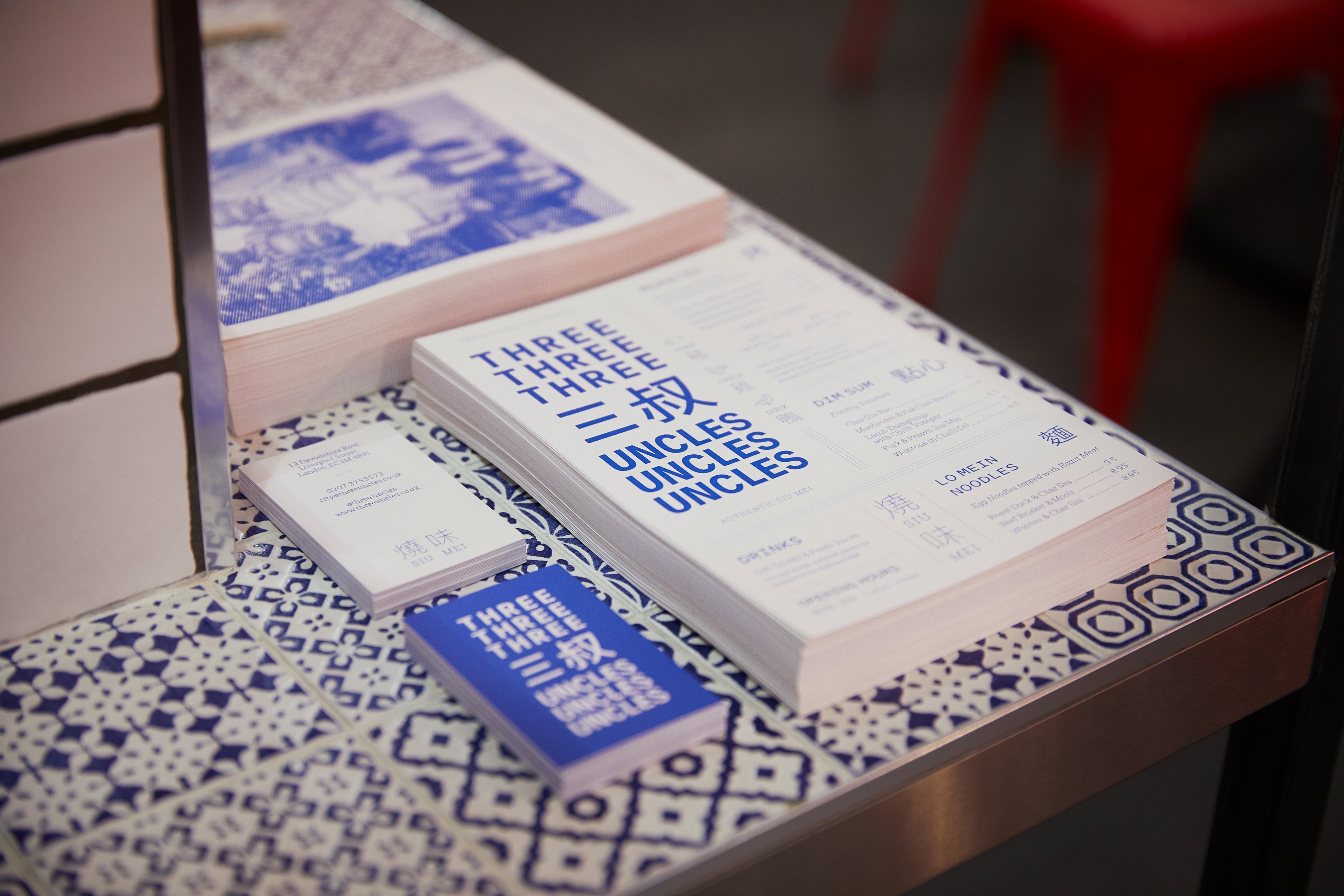
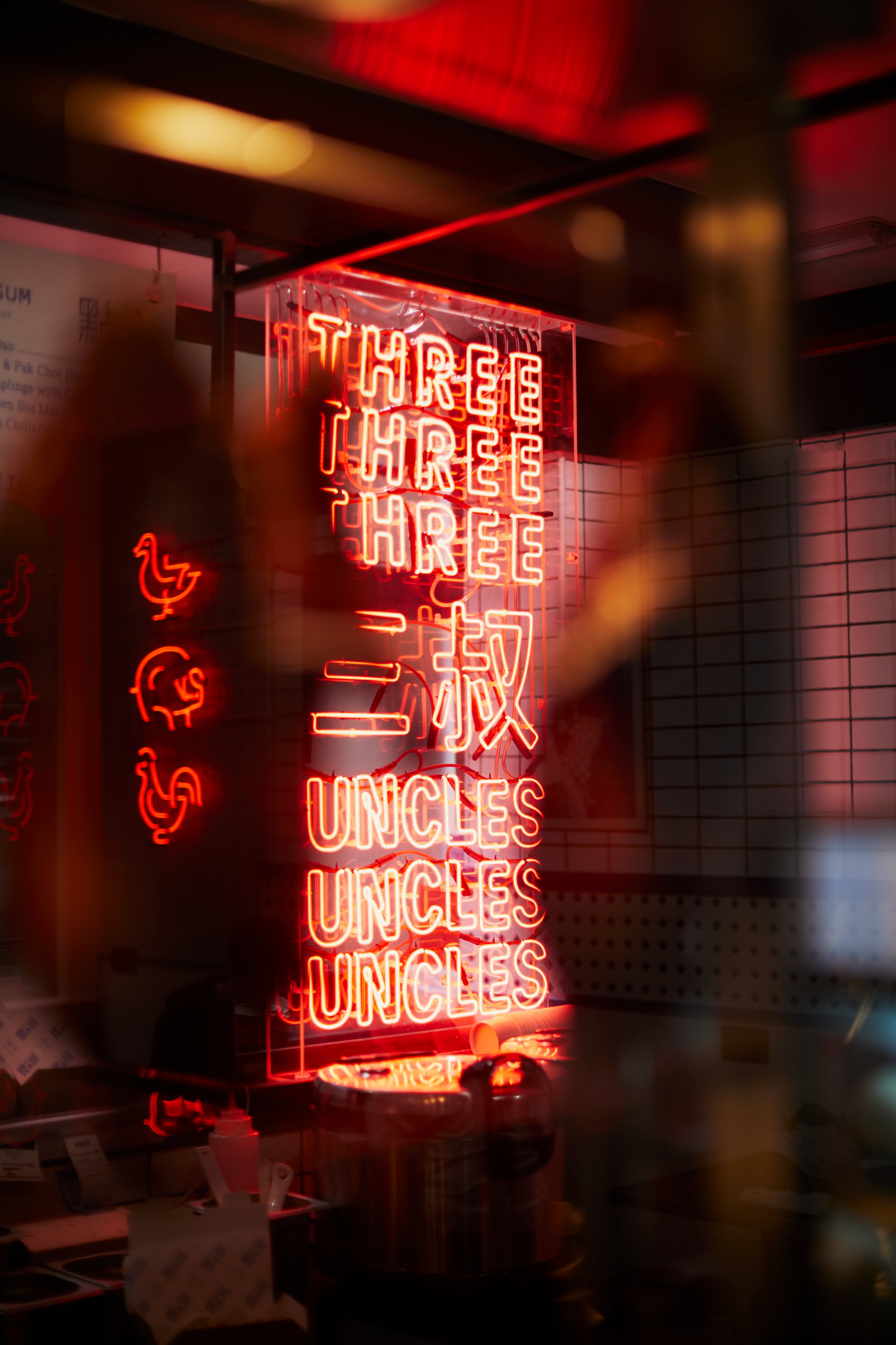
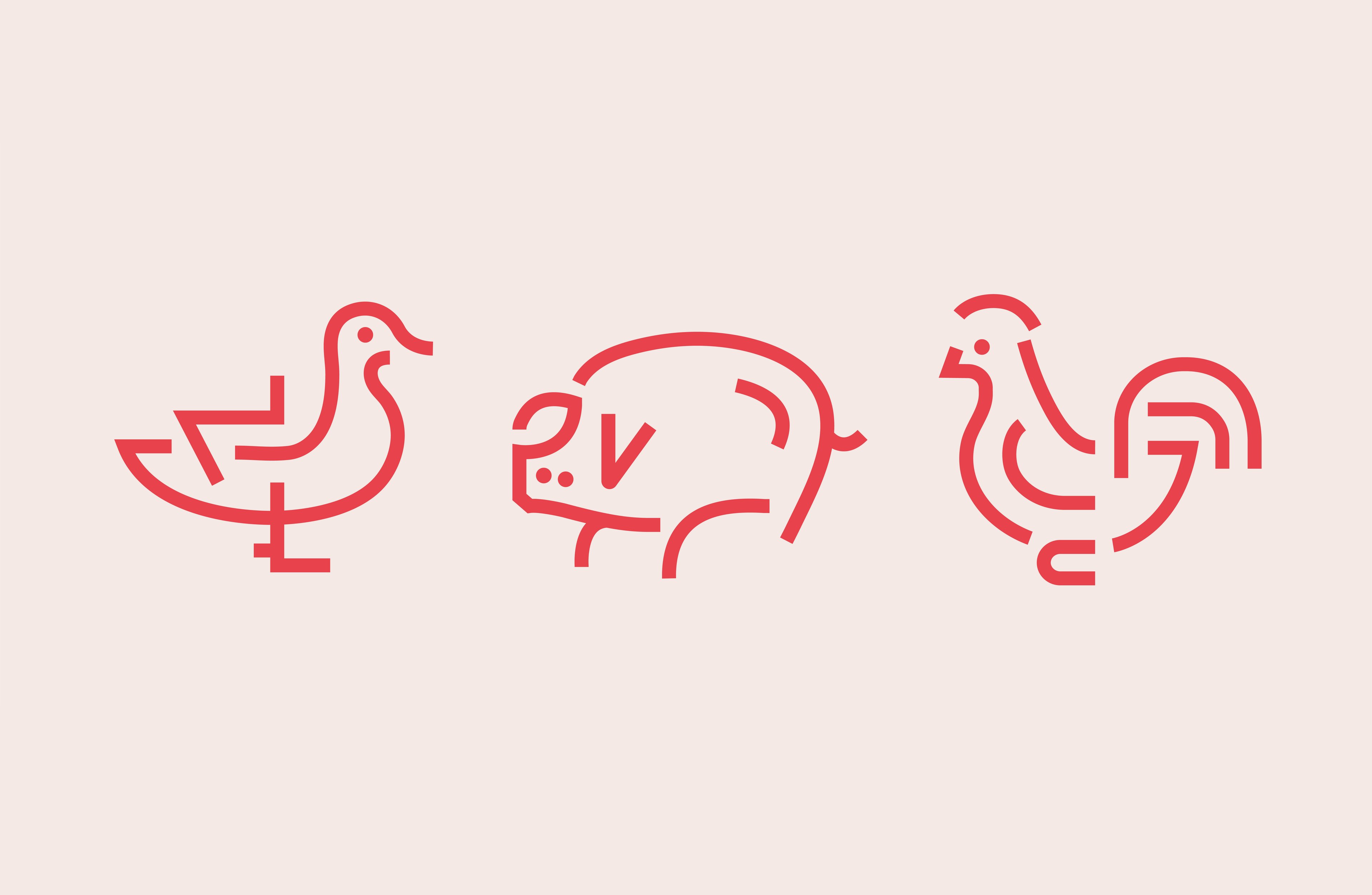
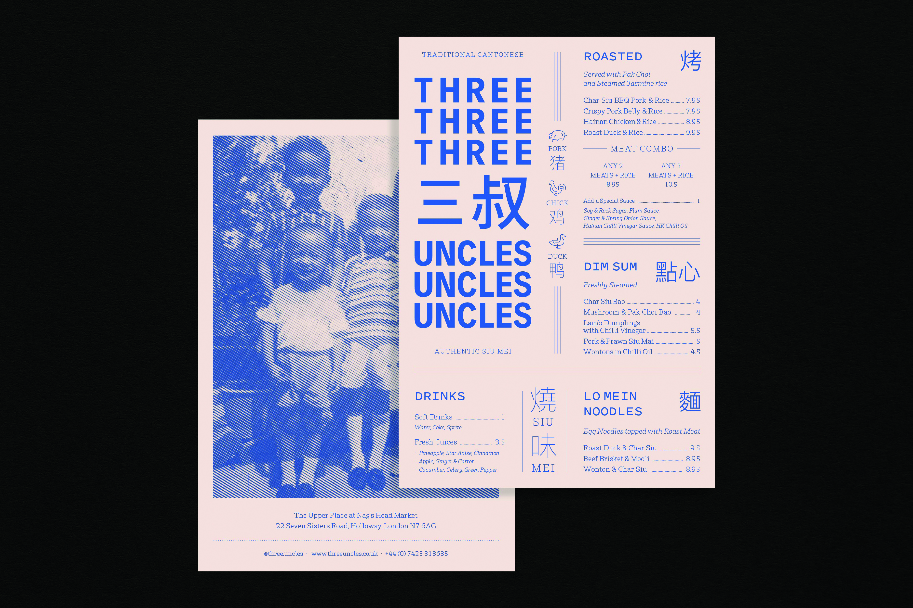
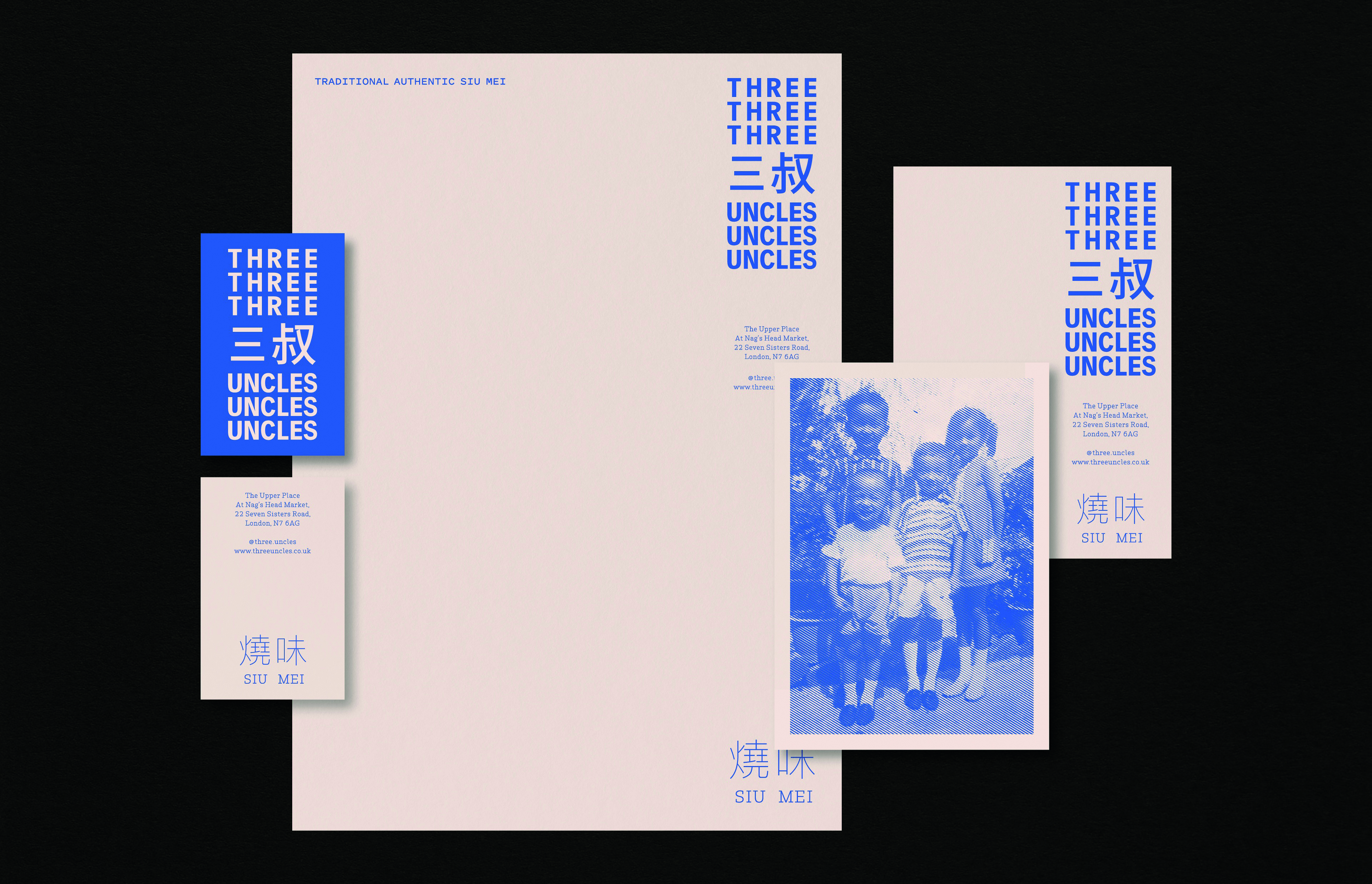
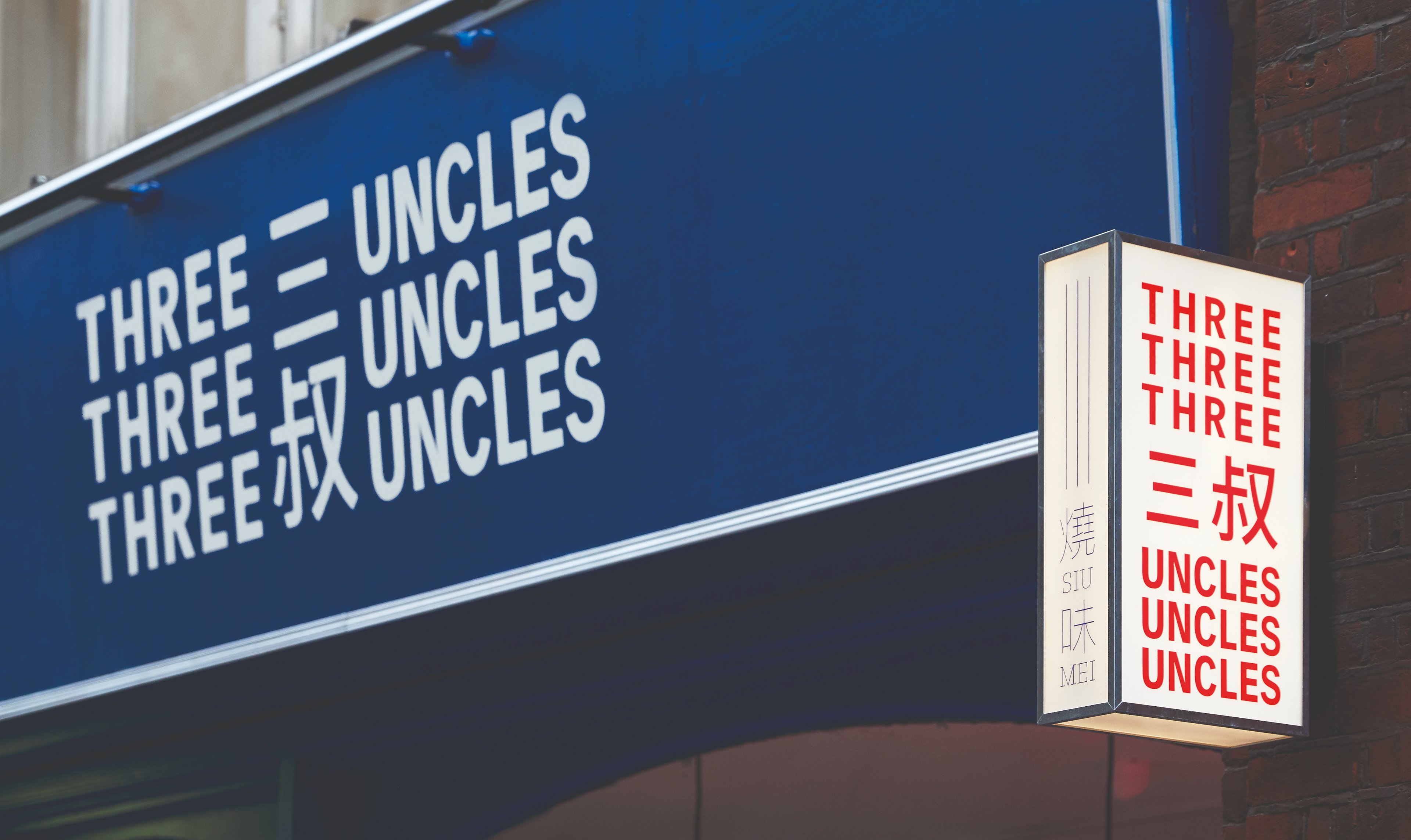
The bold typographic logo references the theme of repetition, abundant in Hong Kong's neon street signs and high-rise buildings (an iconic part of the uncles’ memories), but also the repetition of chopping and stacking that defines the Sui Mei cuisine. The half tone images, taken from the founders private family archives, add nostalgia to the story and the bespoke animal icons and typography add a modern twist to this traditional cantonese restaurant.

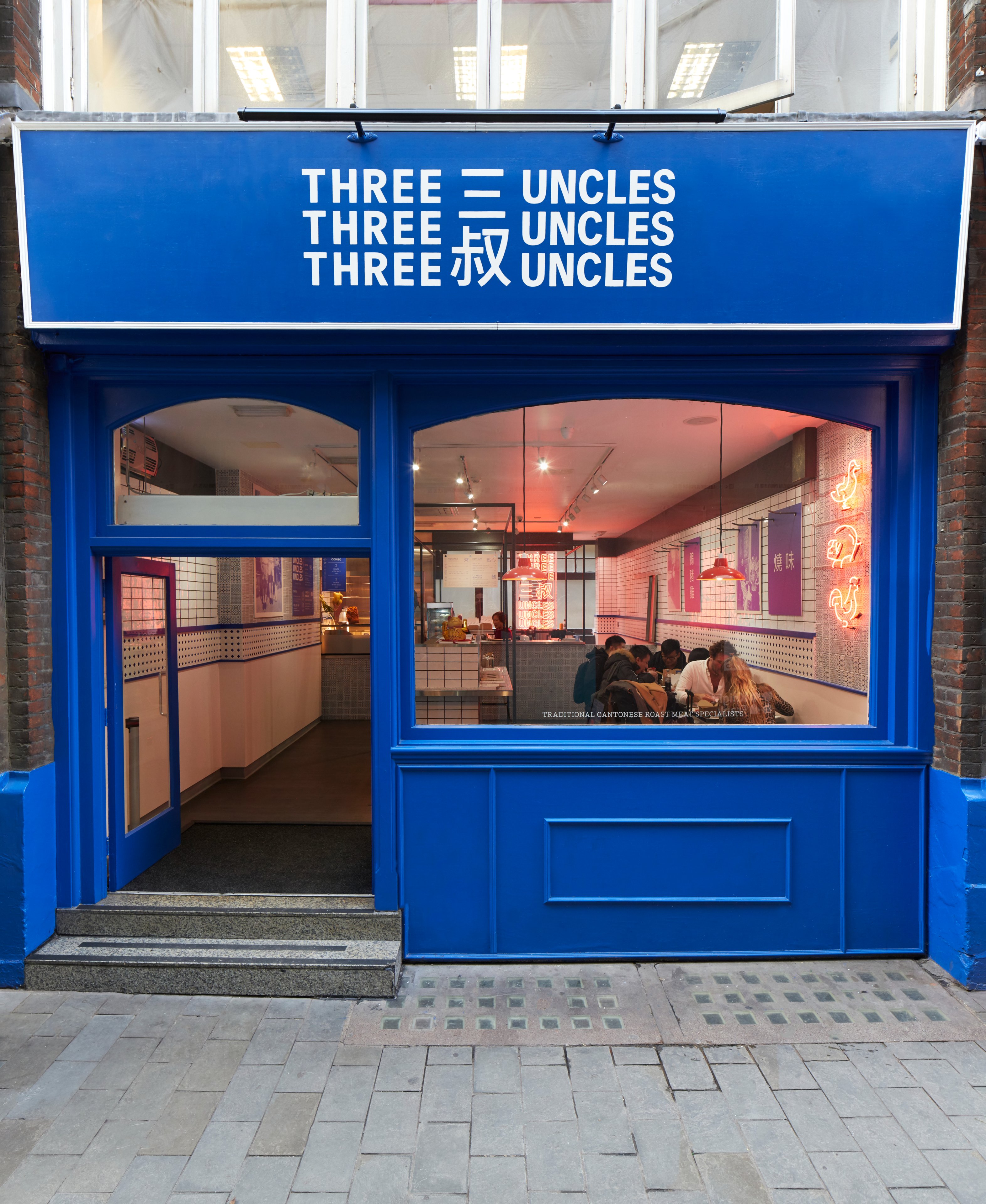


The Hong Kong story
Much of the brand's identity is influenced by the visual language of Hong Kong. The observations we made when looking at hundreds of images helped inform many key decisions when we designed the interior of the restaurant. Menus were hung off architectural frames and an oversized neon logo helped set the mood, reflecting in the glass and stainless steel wall claddings. We used an eclectic tile selection to add depth and warmth, a look we noticed on the walls in many of Hong Kong's street food establishments.

HongKong street signs and food culture