The Sando House
In recent years the Japanese Sando has become highly fashionable. Often made from revered Wagyu or Kobe beef, the Sando has become an iconic 'must try’ dish for globe trotting gourmets. The Sando House founders saw its success in Japan and the US … it was time to take it to Shanghai. Combining excellent and accessible food within a space where millennials could meet, eat, watch films, view art and party, they wanted to create a hub for the discerning, culturally hungry, bright young stars of Shanghai. A place to rest, replenish and feed not only your stomach but your soul.
We created a brand that clearly puts this characterful sandwich centre stage. A brand that encourages conversations and inspires creativity. The challenge was to balance personality and playfulness with real credibility. The origins and story of the Sando needed to be acknowledge whilst also speaking to the chic, culturally astute locals. We added a little humour too, it is just a sandwich after all!
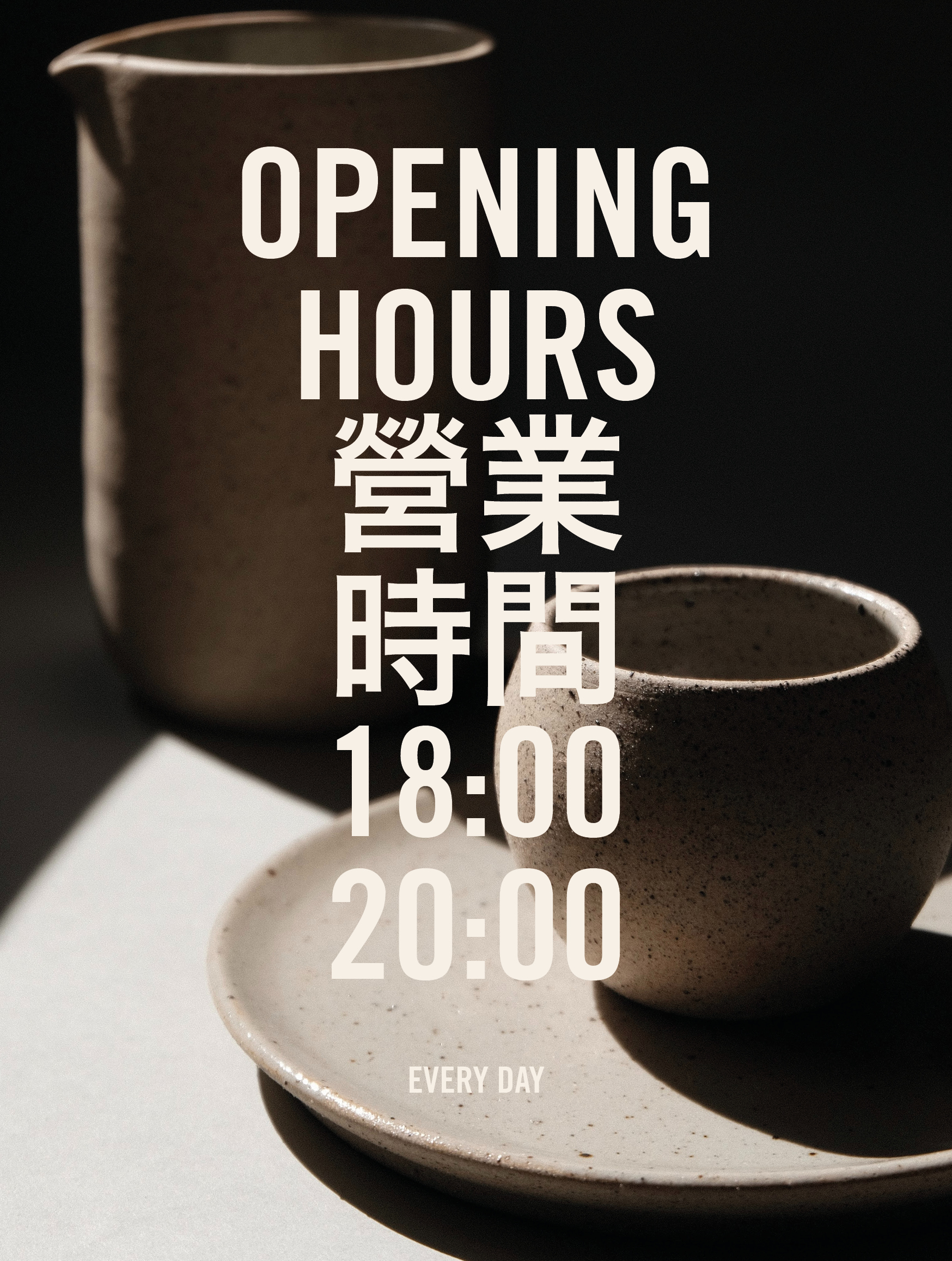
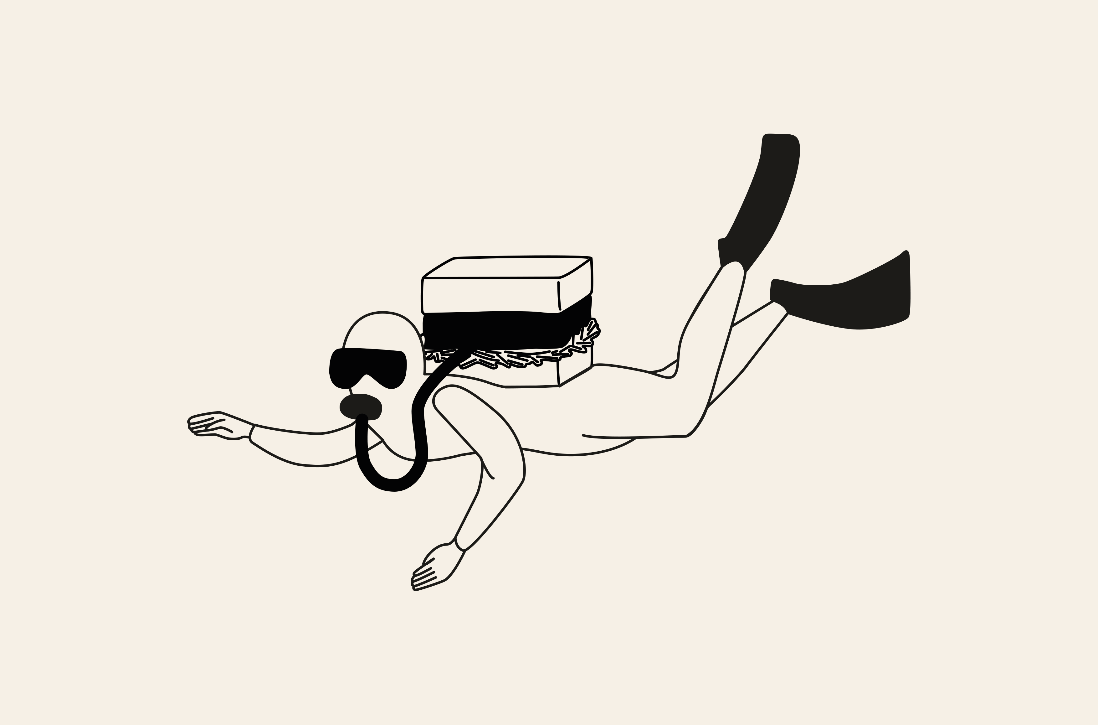
The identity was underpinned with a set of tongue-in-cheek illustrations depicting surreal scenes featuring the Sando sandwich as the focal point with a playful twist. To further nod to the product we chose a strong, clean illustrative style that is reminiscent of Japanese anime. These illustrations were then paired with bold sans serif typefaces that sit comfortably in worlds of modern art, fashion and urban culture. The logo's shape was directly inspired by the structure and form of the classic Sando sandwich. A crisp cut oblong, full to the edges.
Unfortunately, due to the unpredictable nature of the times we live in, this project never launched.
Services:
Branding
Packaging Design
Illustration
Interior Design Consultancy
Notes:
Unfortunately this project never launched, creative copyright remains with Studio NinetyOne.


三明治屋 = sandwich cottage. we currently have sandwich club kind of thing but club has been shortend to single character.

茶雞尾 (tea cocktail) - we have tea tail


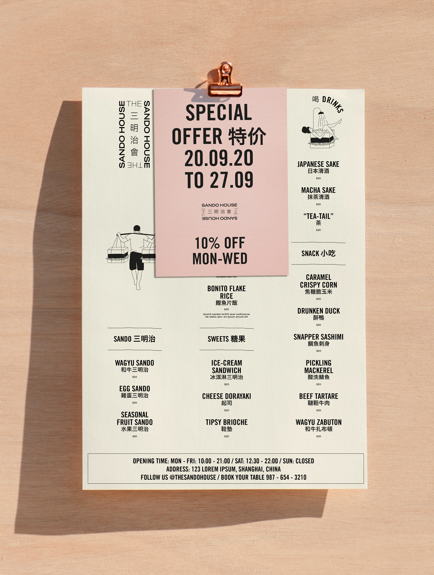

words below shanghai mean special offer